ERS
ERS is a centralized platform that helps government agencies collect revenue digitally replacing paper receipts, manual records, and disconnected tools with one connected system. I designed three surfaces: the Agency Admin web dashboard (operations and management), the Field Officer Android app (registration and payment collection), and the Executive web dashboard (real-time performance monitoring).
00

problem
— Manual collection had no accountability.Field officers wrote levy amounts by hand. Receipts could be forged. An agent could collect ₦50,000 and remit ₦35,000 with no system catching the difference. — Revenue performance was invisible until it was too late.Information lived in spreadsheets across multiple agencies. By the time a problem was visible, the money was already gone. — Admins had no central place to manage operations.Thousands of traders, invoices, and debt recovery cases spread across disconnected tools with no unified view. — One interface cannot serve every user.A Field Officer in a market needs something completely different from an Agency Admin or a Governor giving everyone the same screen was a usability and security failure. The core design challenge: build one system that works for a non-technical field agent on a low-end Android phone with poor signal and for a Commissioner reviewing performance between meetings without either experience feeling like it was designed for someone else.
My Biggest Challenge
The Agency Admin dashboard was the hardest surface to design. It had close to 20 sidebar items including a set of AI-powered features like revenue forecasting and debt impact prediction and the more I worked on it, the clearer it became that the complexity was becoming a problem, not a feature.
Looking at the design, a user would open the sidebar and face nearly 20 options with no clear sense of where to start. The AI features were powerful in theory, but they added a layer of complexity that the core users government agency staff who were new to digital revenue tools were not ready for yet.
I brought this to the team. Together, we had a direct conversation with the product owner explaining that the current version was too complex for the people who would actually be using it day to day, and that the right move was to focus on the core workflow first and introduce advanced features in a future update. He agreed.
The sidebar went from nearly 20 items down to the essential modules only.Revenue sources, billing, collections, traders, users, reports, and security.
The AI forecasting and debt prediction features were moved to a future release not removed from the product vision, just deferred until the foundation was stable and users were comfortable with the platform.
The result was a dashboard that a new Agency Admin could open and immediately understand a clear sidebar, a logical flow, no confusion about where to go or what to do first.
Before I Designed Anything
ERS is not a simple product. It has eight user roles, multiple functional modules, and data that flows between them in ways that are not immediately obvious. Before I opened Figma, I needed to fully understand the system not just what it does, but why it works the way it does and what each user actually needs from it.
I spent real time in this phase. Late nights going through the product documentation, asking questions, mapping out the revenue cycle step by step, and making sure I understood the business logic behind every module before I tried to design a single screen.
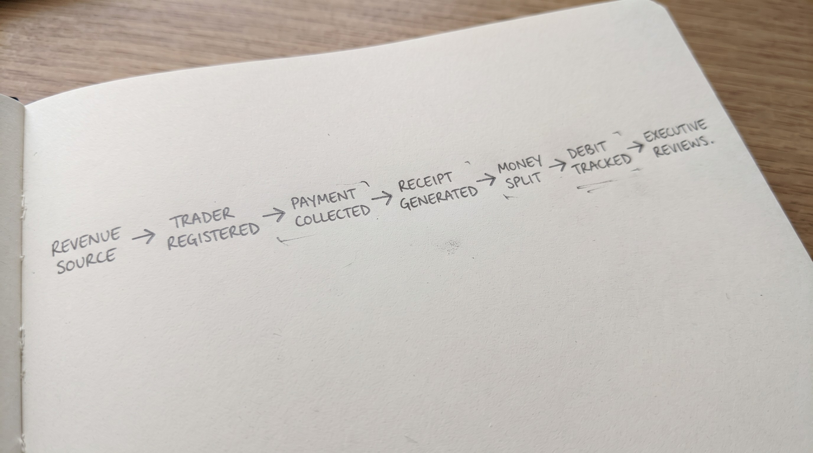
I broke the system into its core stages:Revenue source creation, trader registration, payment collection, receipt generation, debt tracking, and executive reporting.
I mapped each user role to the stages they are responsible for so I understood exactly where the Agency Admin's job ends and the Field Officer's begins, and what the Executive needs to see as an output of both.
I identified which surface needed the most design thinking the Agency Admin dashboard, because it touched every part of the system and had the most complexity to manage.
That research foundation is what made it possible to have an informed conversation with the product owner when the complexity problem came up. I was not guessing I understood the product well enough to know what mattered and what could wait.
DESIGN SYSTEM
System Before Screens
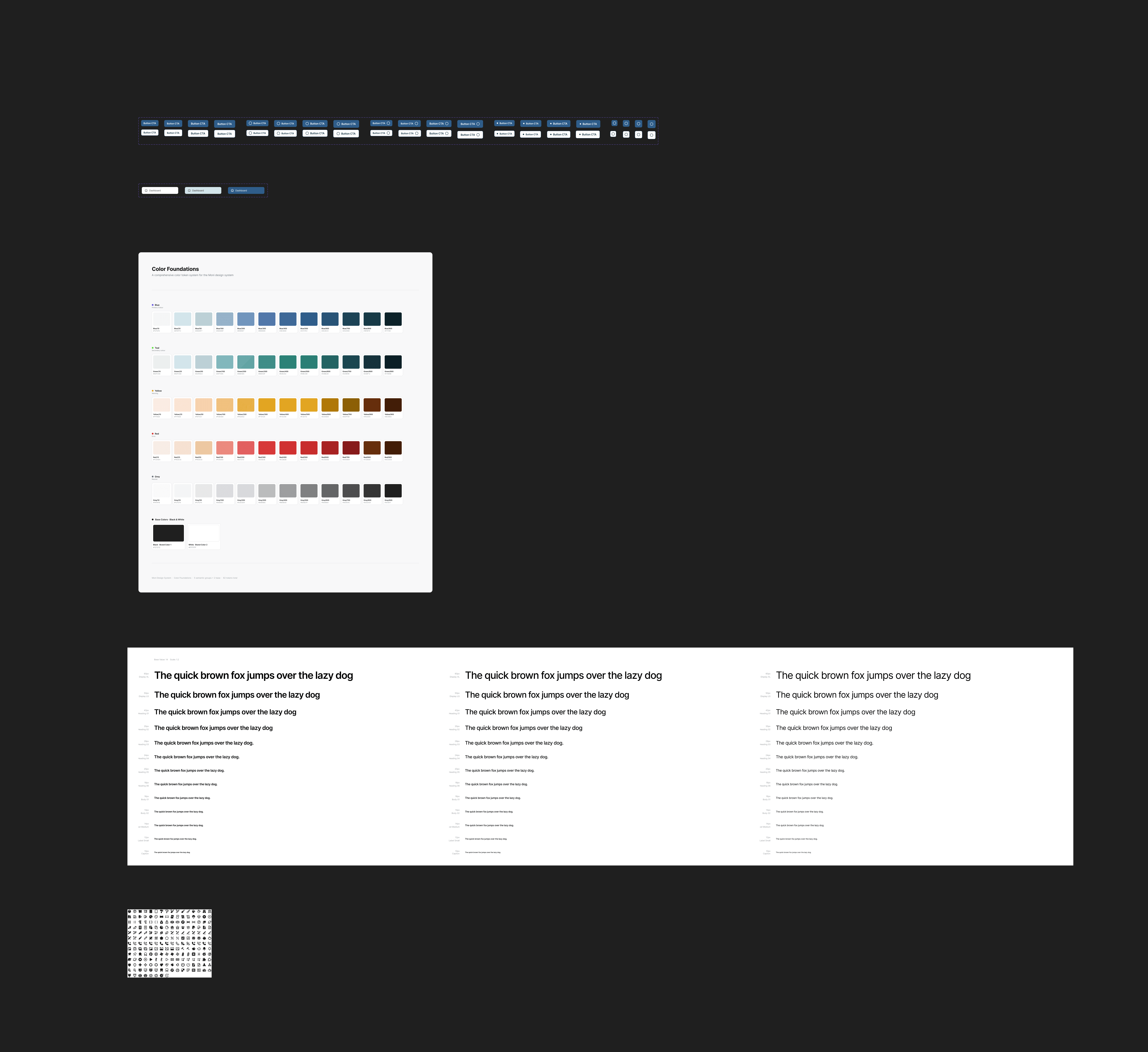
With three surfaces sharing a design language, I built the component library first. Status tags, table rows, button states, cards, and form inputs are defined once and reused across every module.
THE SOLUTION
The Solution
Three surfaces. Each designed around a specific user and a specific set of problems.
01 Agency Admin Dashboard
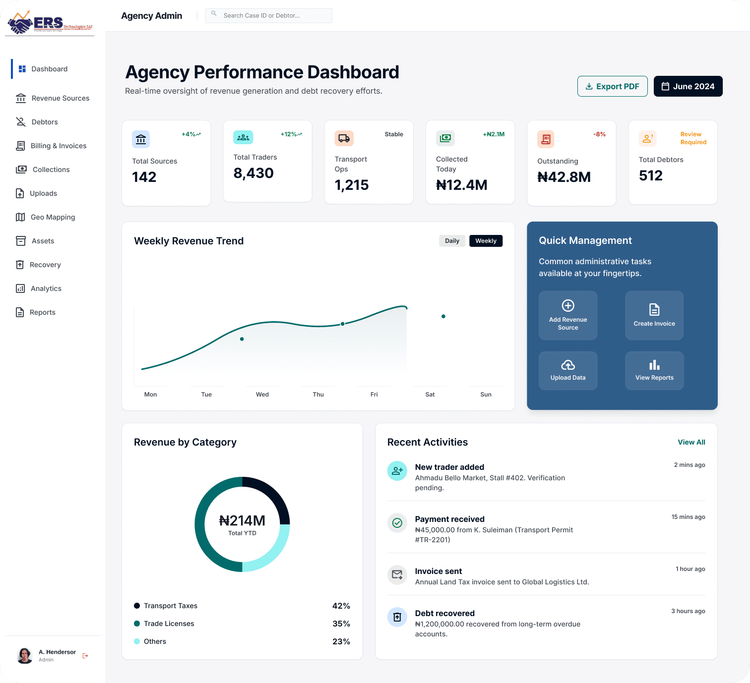
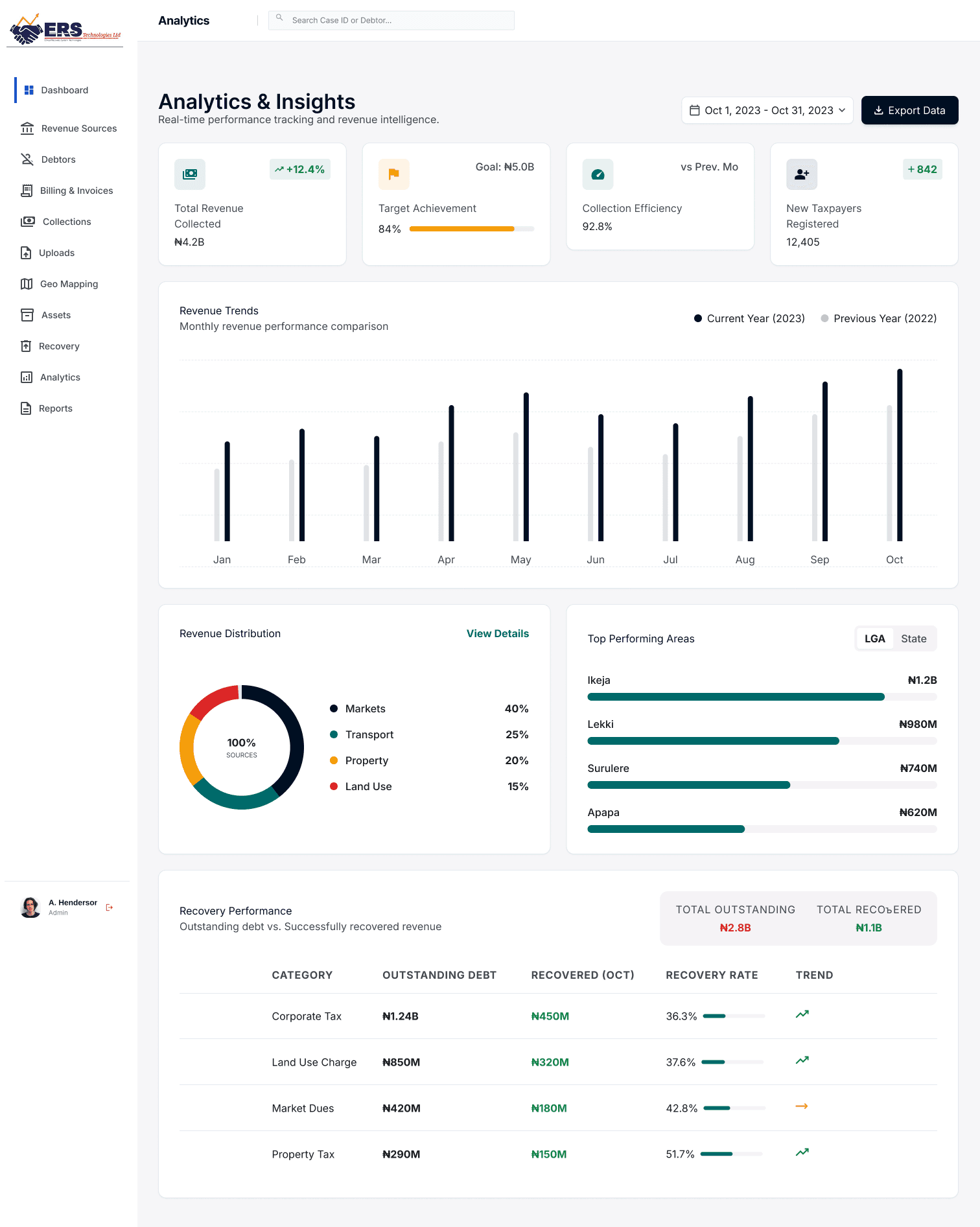
Revenue source amounts are locked at admin level. Field Officers see the levy displayed there is no field to change it. This was the most important anti-fraud decision in the platform.
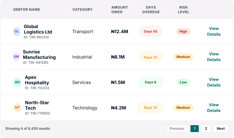
Invoice status uses colour-coded tags. An admin scanning 200 invoices reads the state of each one in under a second.
Debt ages automatically into four buckets: 30, 60, 90, and 120+ days.Older debts surface higher with stronger visual urgency it is designed in, not left to the admin to notice.
02 Field Officer App
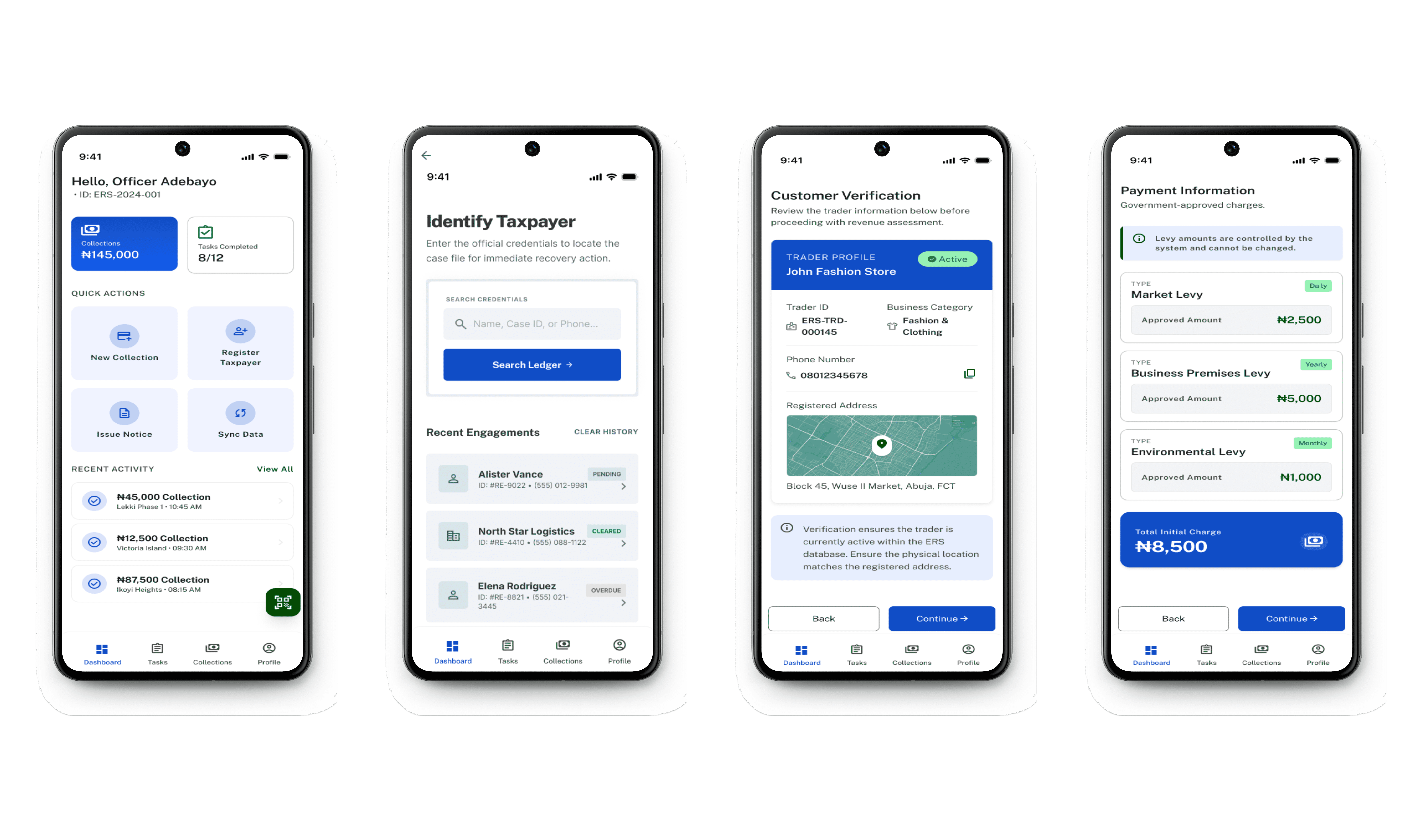
Three actions are always on the home screen:Register Trader. Register Transport Operator. Collect Payment. No hunting through menus. These are the only things a Field Officer does all day.
The levy amount is displayed never entered.Scanning a QR code loads what the trader owes. There is no text field. The agent cannot type a different number. This removes the most common form of field-level corruption in one design decision.
Offline mode activates automatically when internet drops.Collections are saved on device and sync when connection returns. A persistent sync counter on the home screen means the agent always knows whether their work is safe.
03 Executive Dashboard
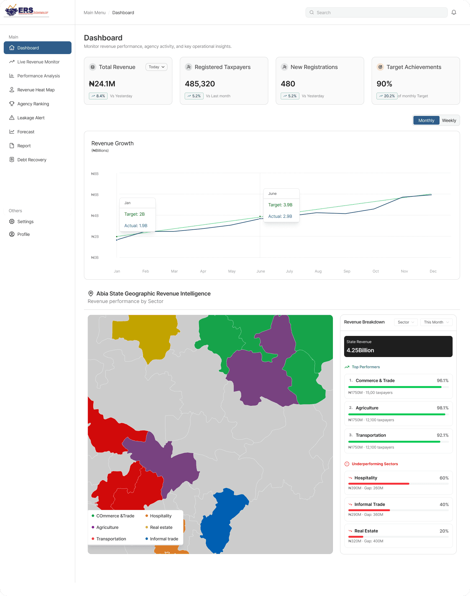
Live revenue counter is the first element on the page.Today, this week, this month updating in real time. A Governor opens this and knows the headline in under two seconds without clicking anything.
The heat map replaces location tables.High-revenue areas. A geographic pattern visible in seconds something a table never achieves.
There is no form, no button, no edit action anywhere on this surface.Every screen is read-only. Executives get insight without the risk of accidental changes to operational data.
Three Decisions Worth Explaining
01 Lock the levy amount on the Field Officer app
The problem:
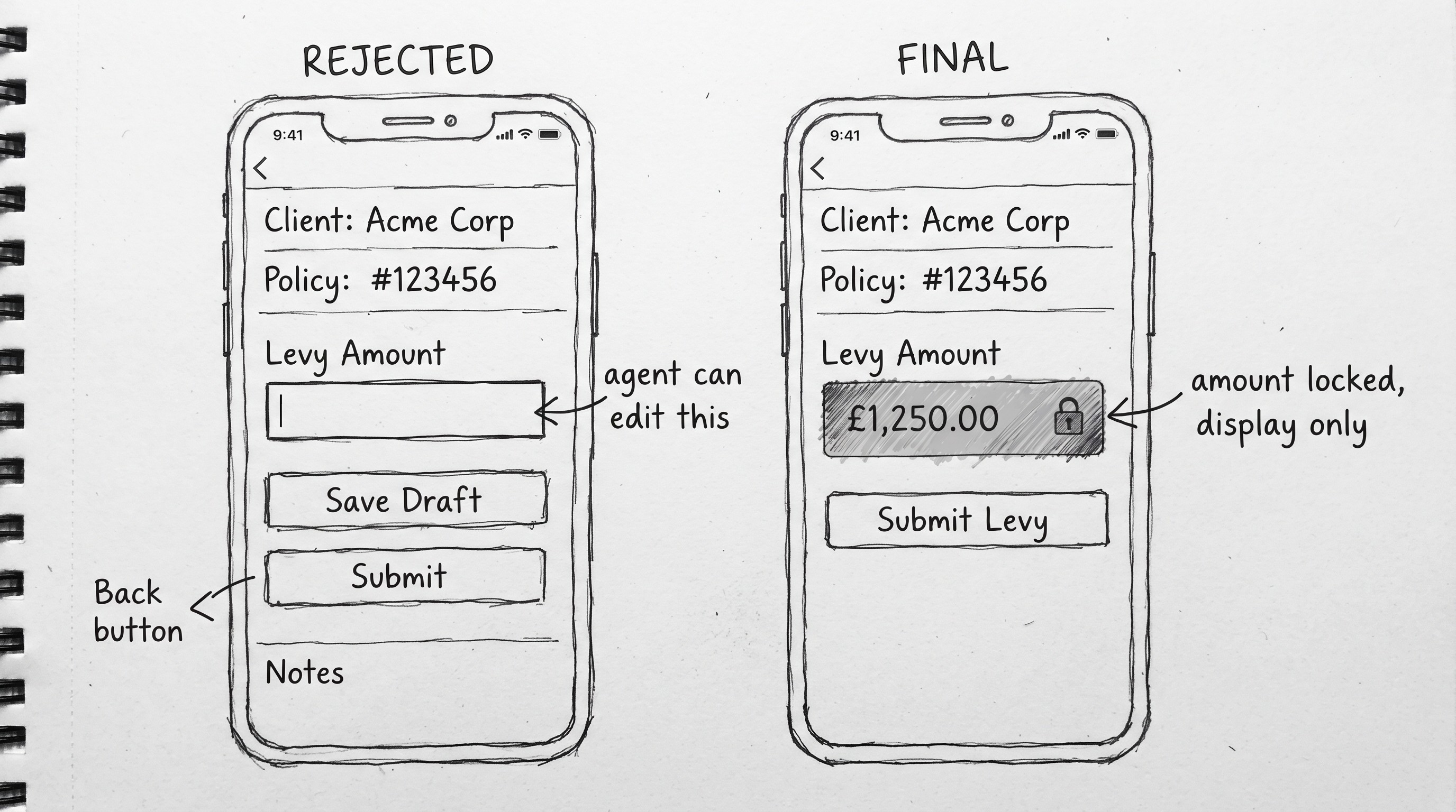
Agents wrote levy amounts by hand. The gap between what they wrote and what they remitted was where money disappeared.
What I chose:
Remove the input field entirely. The system displays the amount. The agent has nothing to edit and no workaround.
Why:
A warning can be ignored. A field that does not exist cannot be manipulated. If fraud prevention is a platform goal, the design should make it structurally impossible not just visually discouraged.
02 Offline-first architecture for the mobile app
The problem:
Field Officers work in markets where connectivity is unreliable for hours at a time. An app that needs internet to confirm a payment is useless for half the working day.
What I chose:
Offline-first by default. Collections store on device and sync automatically when connection returns. Sync status is permanently visible on the home screen.
Why:
Designing around ideal conditions ignores where Field Officers actually work. The right design assumes the worst case no internet and treats connectivity as the bonus, not the requirement.
03 Executive Dashboard is read-only by design
The problem:
Executives have the highest system access. Allowing edits — even small ones creates accountability gaps and the risk of accidental changes to live operational data.
What I chose:
Zero editable elements. Executives can view, drill down, export, and escalate but cannot create, edit, or delete anything.
Why:
High access does not mean high operational involvement. Separating visibility from editability keeps the executive experience fast, uncluttered, and safe.
OUTCOME
Outcome
If this has shipped with real usage data, replace these bullets with actual numbers. Real metrics always beat design impact statements. If it has not shipped yet, use the version below as-is.
ERS is currently in development. The Agency Admin Dashboard and Field Officer flows are complete and have been reviewed with stakeholders / team.
Three distinct role-based surfacesbuilt on one shared component system updates to a component propagate across all three surfaces without rework.
Field Officer registration reduced to a 7-step guided flowfrom a previously unmapped manual process with no consistent steps.
Invoice status visibility addressed through colour-coded tags Agency Admins can read the state of hundreds of records at a glance without reading individual status text.
REFLECTION
What I Learned
The most important thing this project taught me is that understanding the product is not a step you do before the real work starts it is the real work. The hours I spent learning ERS before touching Figma were the reason I could make confident decisions later. Without that foundation, I would have been designing screens without understanding what they were for.
This project also showed me that being a good designer sometimes means telling a client or product owner that less is more and being able to back that up with a clear reason. Recommending we cut the AI features was not the easy call. But it was the right one, and the product is better for it.
ERS taught me that enterprise design is not about making things look good it is about making complex operations feel simple enough that the right person can complete the right task, quickly and confidently, every single time
year
2026
timeframe
1 months, 2 weeks
tools
Figma
category
UI/UX
01
see also

