Formade
This project is a mobile-first e-commerce marketplace app that allows users to buy and sell products easily, similar to Jumia and Jiji. The focus of this design was not just on transactions, but on clarity, trust, and speed. The idea was to create an app that feels simple enough for first-time users, yet powerful enough for regular sellers and small businesses. Everything in the design was guided by one question
00

problem
Most marketplace apps today feel crowded and overwhelming. Users are often forced to deal with too many steps before they can buy or sell something. Sellers struggle with long listing forms, while buyers hesitate because they don’t trust the seller or the platform. From studying existing platforms, I noticed that: Buyers get tired of cluttered interfaces Sellers want speed, not complexity Trust is often treated as an afterthought When users feel confused or unsure, they simply leave.
solution
I started by cleaning up the interface and removing unnecessary elements. Each screen focuses only on what the user needs at that moment, using clear layouts, proper spacing, and simple visuals. This makes the app easy to understand and comfortable to use, especially for first-time users. Next, I simplified the selling process. Instead of long forms, I broke product listing into a few short steps like adding photos, entering basic details, and setting a price. This helps sellers list items quickly without feeling stressed or bored. To improve trust, I made it part of the design itself. I added clear product images, visible seller profiles, ratings, and an in-app chat so buyers can easily communicate with sellers before making a decision. These features help users feel more confident and safe while using the app. For buyers, I designed a smooth browsing and buying flow. Products are easy to find, details are clearly displayed, and actions like chatting or buying are always easy to access. This reduces hesitation and keeps users engaged. Overall, by reducing clutter, shortening user flows, and building trust into the interface, Formade solves the common problems found in marketplace apps and creates a better experience for both buyers and sellers.
Design process
I approached this project with a product mindset, not just visual design. Every screen was designed to answer a specific user question: Where am I? What can I do here? What should I do next? Instead of dumping all features on users at once, the experience reveals things gradually, making the app feel calm and intuitive.

Competitive Analysis
To understand the market, i studied three popular apps
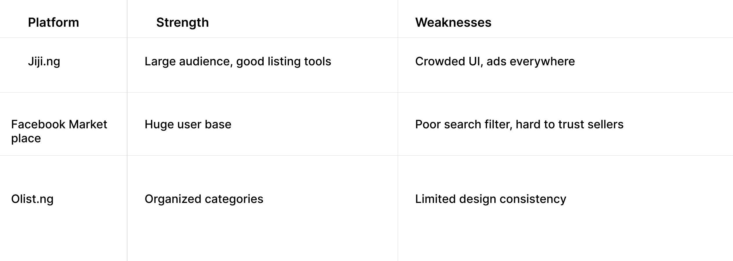
What I Learned:
People want trust and clear communication
Clean layout improves trust
Quick access to product details is important
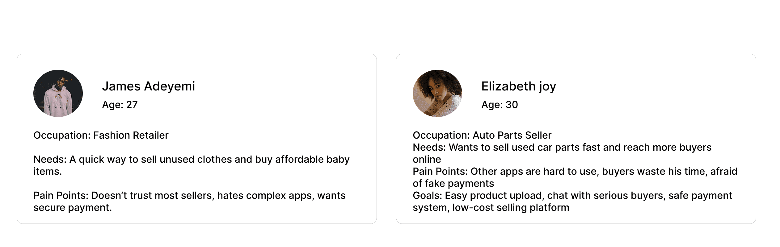
User persona
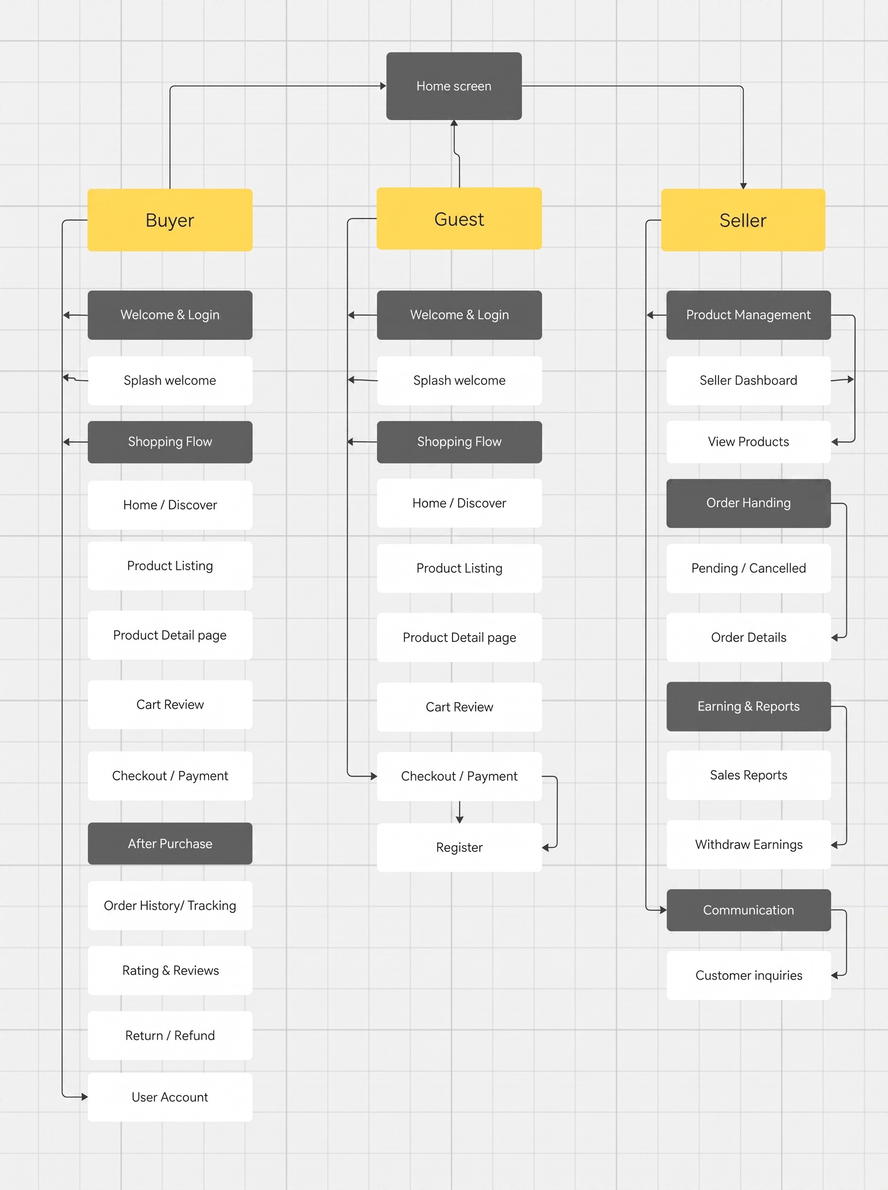
User Flow
Browsing & Product Discovery
The home screen was designed to help users find what they need within seconds. Products are clearly organized into categories, supported by a strong search and filter system. The layout prioritizes visuals, because users connect faster with images than text. Spacing and hierarchy were carefully used to avoid visual noise. The goal was simple: Users should enjoy scrolling, not feel lost while doing it.

Selling Experience
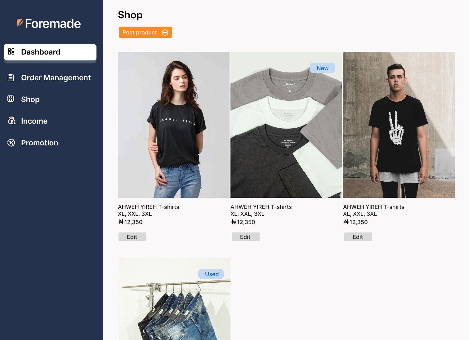
Selling was designed to be as easy as taking a photo. The product listing flow starts with image upload, followed by a short and friendly form. Only essential fields were included, so sellers don’t feel overwhelmed or bored halfway through. The design supports both: Casual sellers listing one item Small businesses listing multiple products This approach removes fear and friction from selling.
Product Details & Trust Building
The product detail page is where decisions happen. This screen clearly shows: Product images Price Seller information Ratings or indicators of credibility Instead of forcing trust with long explanations, the design uses visual confidence clean layout, clear typography, and visible seller identity. If users feel safe, they buy.

gfhh
Website link
Checkout & Payment Flow
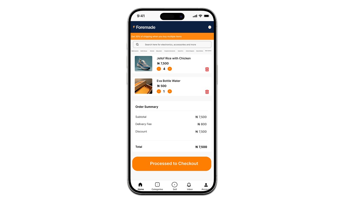
The checkout process was intentionally kept short. Users can clearly see: What they’re buying How much they’re paying What happens next No hidden fees. No confusing steps. Just a smooth handoff from interest to purchase.
Design System
The visual identity balances professional trust with a Gen-Z-friendly vibe. The color palette is calm but confident, typography is clean and readable, and spacing is used generously. The UI feels modern without trying too hard.

Outcome
The final result is a scalable marketplace experience that: Feels easy for beginners Works efficiently for sellers Builds trust naturally Looks modern and professional This project demonstrates my ability to design real-world products that align user needs with business goals.
Final Thoughts
Good marketplace design is not about adding more features. It’s about removing friction. This project reflects my approach as a designer: clear thinking, clean UI, and user-first decisions.

year
2023
timeframe
24 days
tools
Figma & Framer
category
UI/UX
see also

